
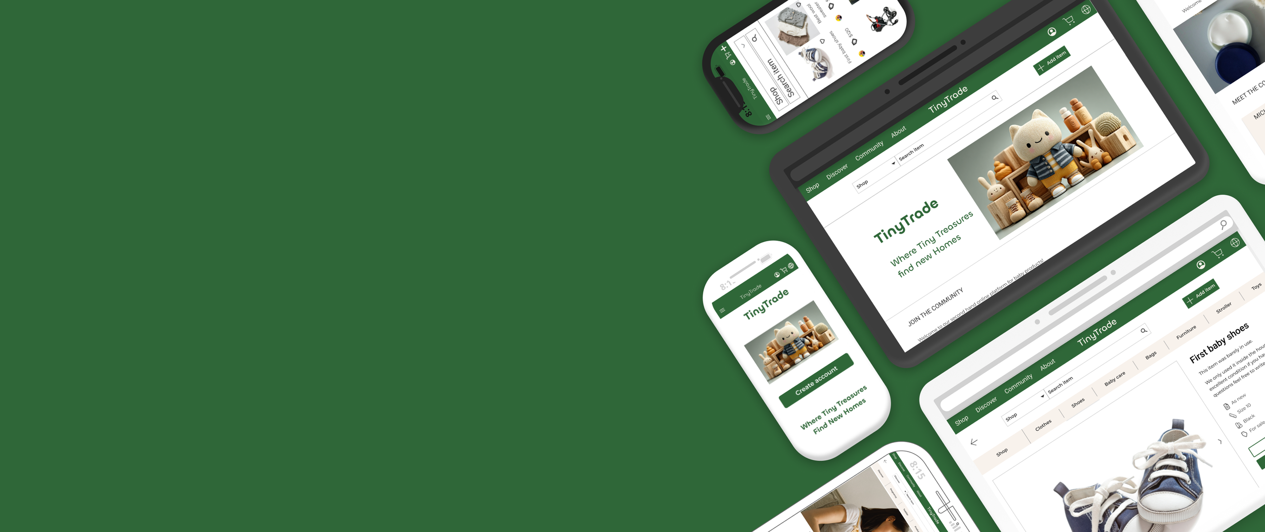

An end-to-end conceptual project
A trusted second-hand marketplace designed for families to buy and sell baby and toddler products.
UX Research & Design by Dalia Grosz
Project background
TinyTrade is a user-centered platform created to solve a core problem in the second-hand market: Trust.
Operating as the sole UX/UI Designer , I led this project autonomously from discovery to high-fidelity prototyping. The goal was to design a safe, intuitive, and community-driven marketplace tailored to the unique needs of parents.
By applying psychological principles to reduce cognitive load and build user trust, I designed a seamless e-commerce experience that handles complex product categorization and encourages sustainable consumption among families.


UI design

Invision
1. Research
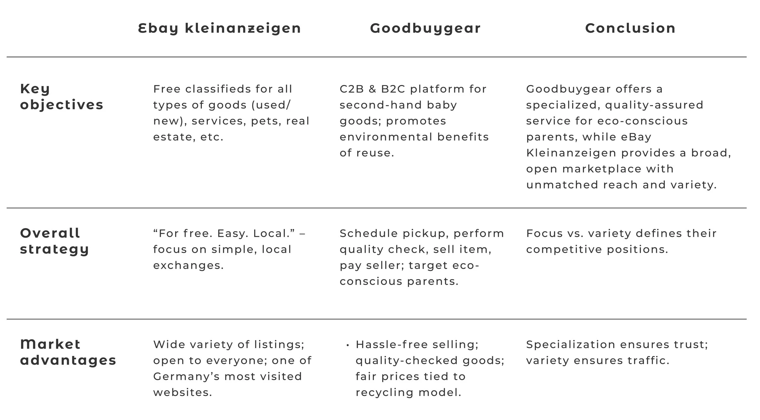
Competitor & UX Analysis
I analyzed direct and indirect competitors (e.g., eBay Kleinanzeigen, Goodbuygear) to identify market gaps.
SWOT analysis
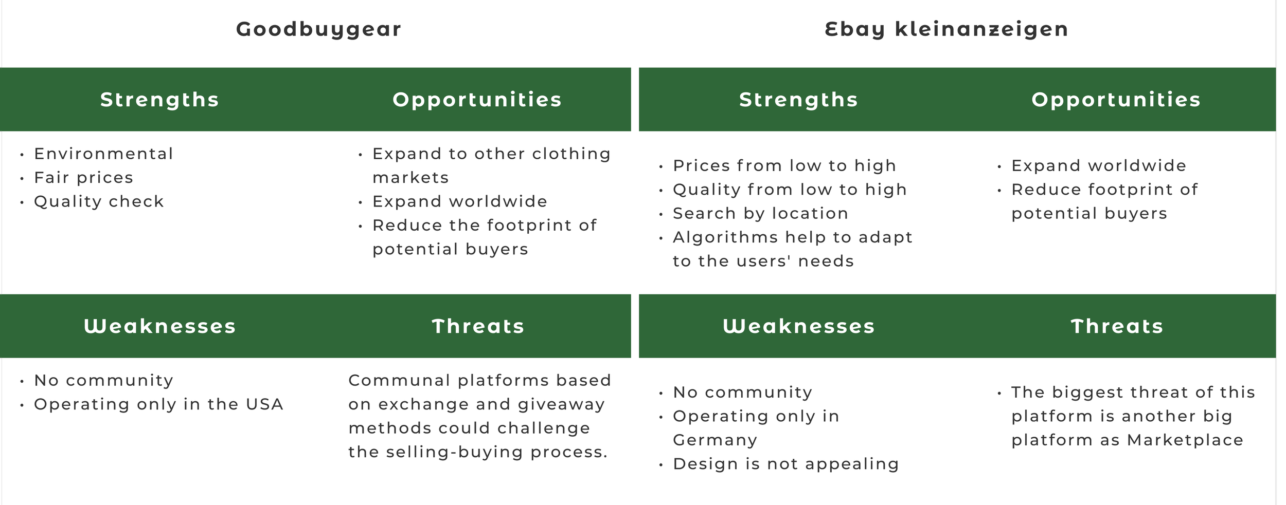
UX analysis - Ebay kleinanzeigen


User Interviews: Uncovering the Psychological Barrier
I conducted in-depth interviews with 5 parents of children aged 0-3 to uncover their emotional drivers, pain points, and second-hand shopping habits.
Interview Goals ▼ expand
- Understand buying & selling habits — Learn how often parents purchase or sell baby/toddler items, and what channels they currently use.
- Identify pain points — Discover frustrations (e.g., trust, safety, quality, convenience) with platforms like Facebook Marketplace or eBay Kleinanzeigen.
- Explore emotional drivers — Understand whether financial savings, environmental consciousness, or decluttering are stronger motivators.
- Assess trust factors — Find out what builds or erodes trust (e.g., seller verification, quality checks, secure payments).
- Test interest in a dedicated marketplace — Validate if a niche platform like TinyTrade would be appealing compared to generalist platforms.
- Gather feedback on potential features — Identify must-have features (e.g., size filters, condition ratings, pickup scheduling) and nice-to-have extras.
- Evaluate mobile vs. desktop preferences — Learn which devices and formats parents prefer for browsing, listing, and purchasing.
- Explore barriers to selling — Understand what stops parents from selling unused items (e.g., time, hassle, uncertainty about prices).
Key Findings ▼ expand
- The Motivation — Flexibility and price negotiation are the biggest drivers for peer-to-peer online buying.
- The Friction (Lack of Trust) — The primary barrier is psychological. Parents hesitate to buy from strangers due to concerns about product safety, hygiene, and the absence of guarantees.
Actionable Takeaway ▼ expand
To succeed, TinyTrade must be designed not just for transactions, but for Trust. The UI must actively reassure users through verified profiles, transparent condition guidelines, and an intuitive layout that reduces anxiety.
2. Empathize
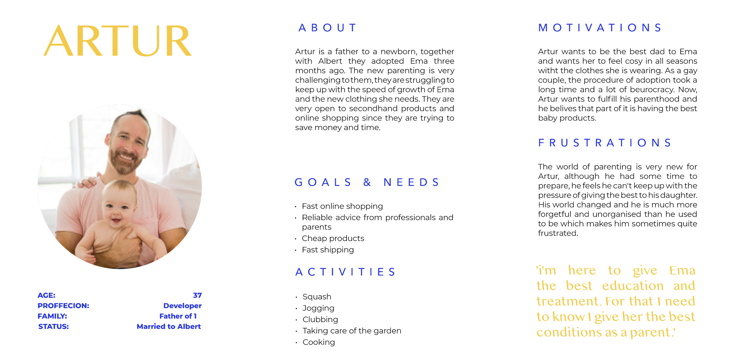
User Personas
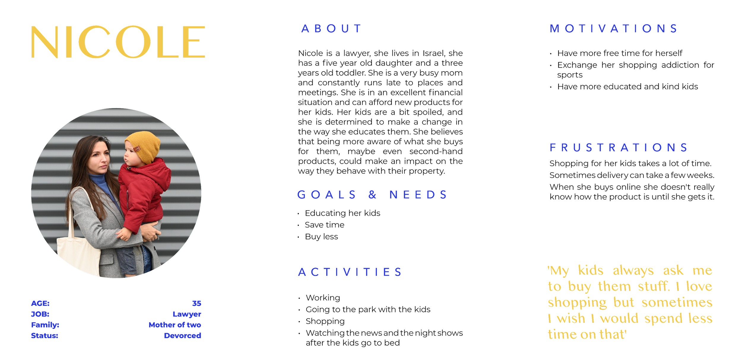
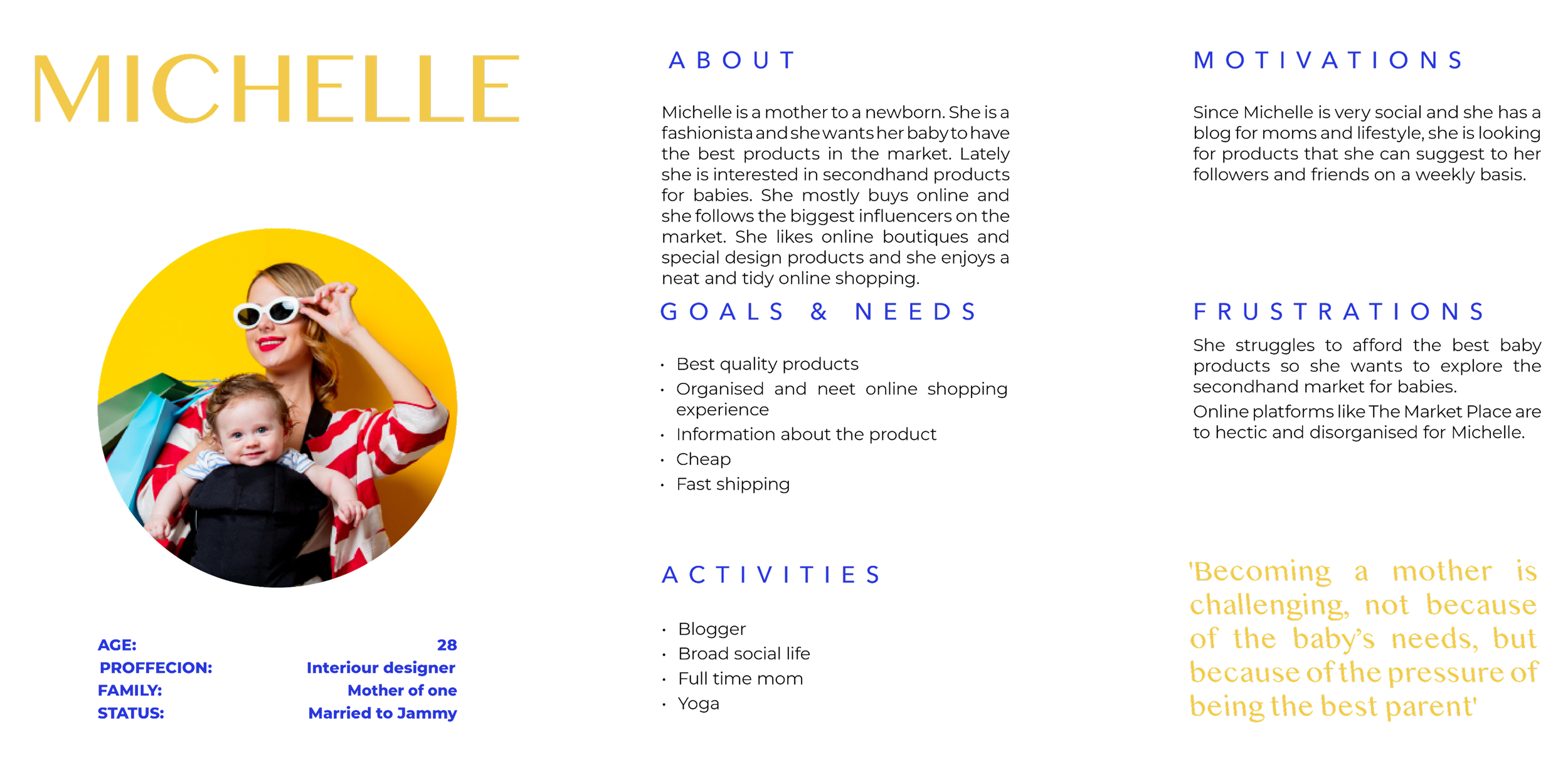
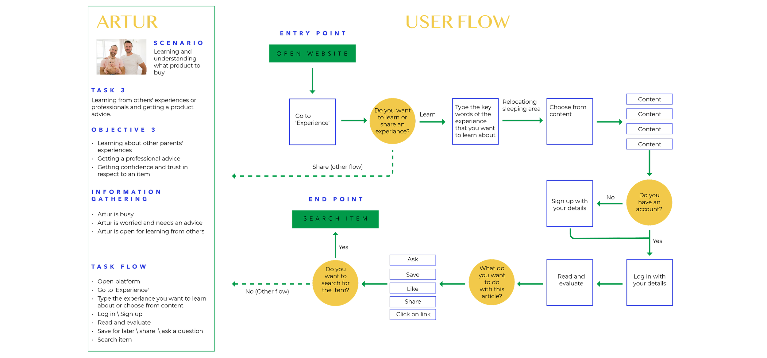
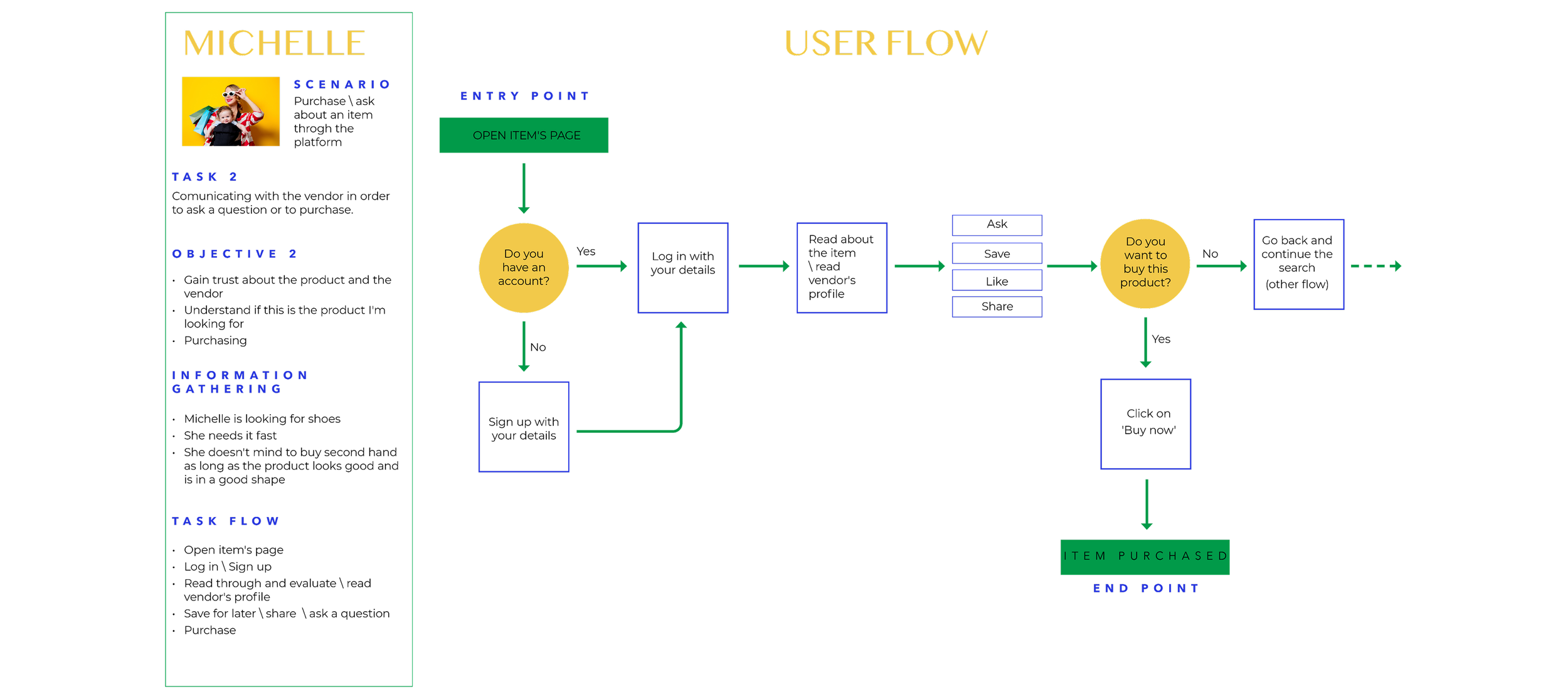
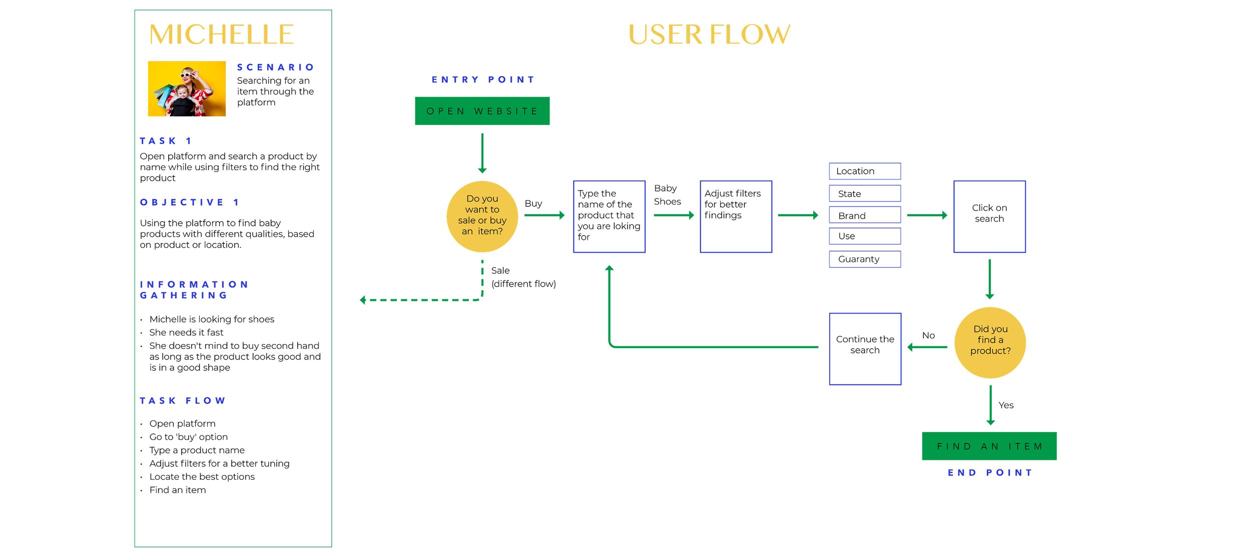
Synthesizing the qualitative research, I developed three distinct personas to guide the platform's architecture.
Rather than just focusing on demographics, I mapped their core psychological barriers. From a new adoptive father seeking validation and community advice (Artur), to a busy lawyer needing extreme efficiency and safety guarantees (Nicole). These mental models directly dictated the platform's feature prioritization.
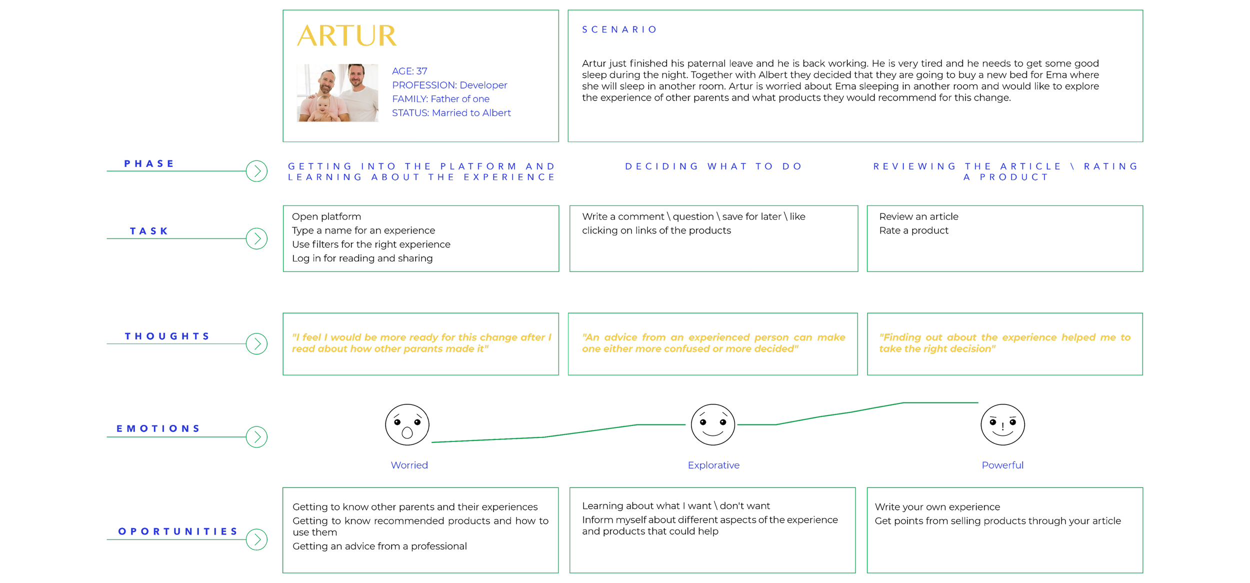
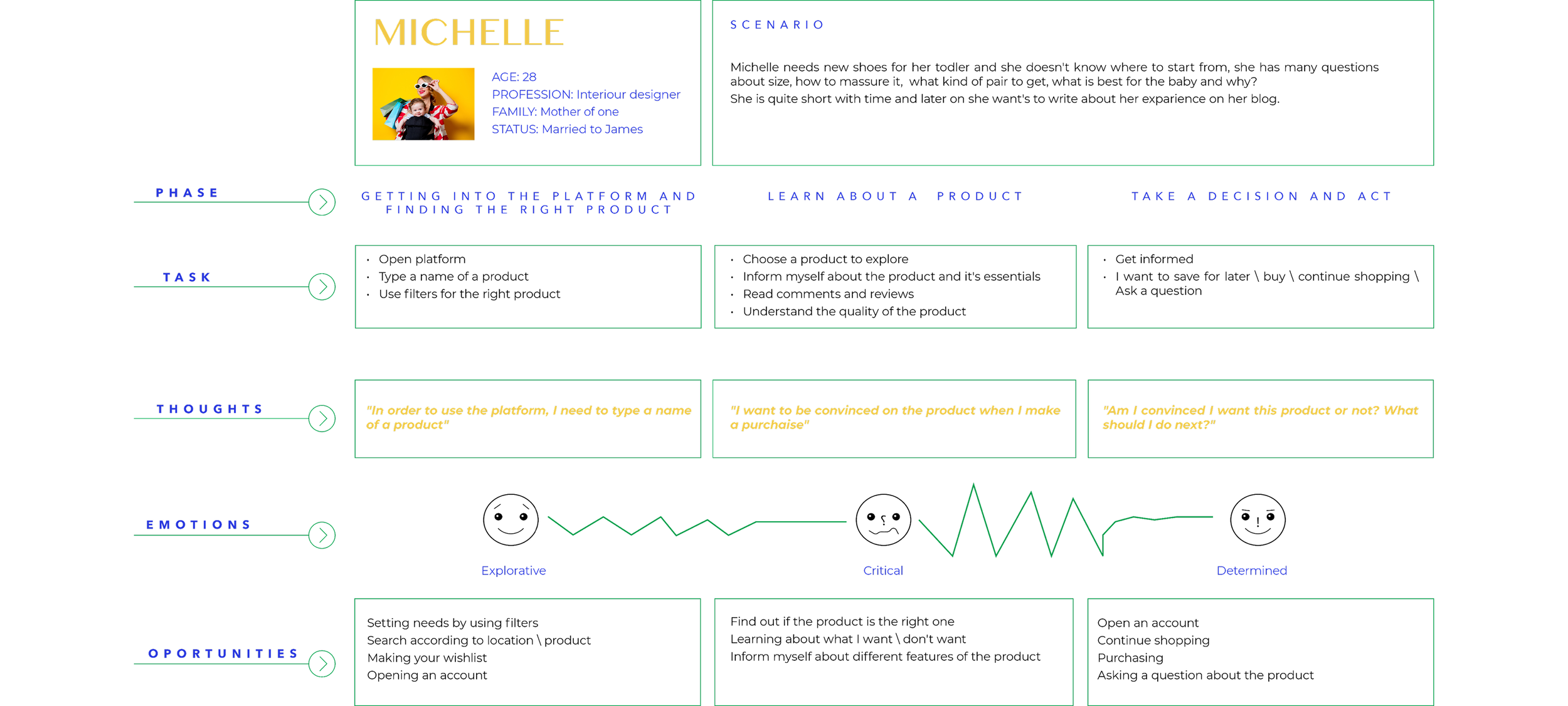
Mental Models & User Journey
3. IDEATE
User Flows
To translate psychological needs into a functional product, I mapped out the end-to-end user flows.
Operating autonomously, I mapped complex scenarios, from discovering community advice to finalizing a secure transaction. The primary goal was to create a frictionless path that strategically places "trust signals" (like verified seller profiles and community validation) at critical decision-making points.
Sitemap

4. Design
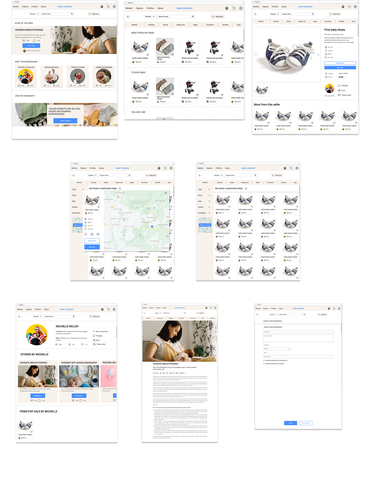
Wireframes low-Fi: Structuring the Experience
I translated the user flows directly into structural wireframes. The primary focus here was on layout and content hierarchy, ensuring a clear separation between the transactional 'Shop' features and the educational 'Community' content, preventing the cognitive overload typically found in competitor platforms.

Wireframes Mid-Fi: Complex Data & Trust Signals
Moving into mid-fidelity, I focused on usability and integrating the psychological 'trust' requirements discovered in the research phase:
Advanced Filtering & Data Management: Designed a robust sidebar and layout to handle complex product attributes (condition, size, brand), allowing busy parents to find exact matches quickly.
Location-Based Search (Map UI): Integrated an interactive map to facilitate local, flexible exchanges, directly addressing the core user need for convenience.
Trust-Building UI: Embedded seller profiles and community stories into the core shopping experience to humanize the transaction and reduce purchase anxiety.
5. Test
Usability Testing: Validating for Trust & Friction
TinyTrade is a web platform used to sell, buy and evaluate products for babies.
The web is designed for parents interested in purchasing second-hand products, enabling them to explore and share their experiences with these goods.
Goals
Operating as the sole designer, I conducted remote moderated usability sessions with 5 target users (parents of toddlers) to validate the mid-fidelity prototypes. Beyond measuring basic task completion (e.g., adding an item or purchasing), the primary goal was to test the 'Trust Signals'. I needed to observe if the UI successfully reduced purchasing anxiety and whether the separation between the 'Shop' and 'Community' reduced cognitive load.
Objectives
Determine if participants understand what the platform is about quickly and easily
and the value it provides.
Observe how users navigate and find how to add products on their web—can
they add products?
Detect weak friction points while navigating—is the design flow of the platform making
sense, are the buttons at the right spots?
Methodologies
The study will be held remotely, at the participants’ chosen place and the moderator’s chosen place.
The moderator will make sure that both the participant and the moderator will have a working internet connection, a computer with a mic, and a camera.
The test will include a short briefing, task performance with Baby Goodies conducted on the web platform, and a debriefing.
USABILITY TEST REPORT: Key Findings & Design Iterations
Based on a severity scale, I prioritized and resolved the most critical usability issues:
Issue 1: Clarifying Value Proposition (Homepage) High severity
Users needed immediate reassurance of the platform's purpose. I redesigned the hero section to instantly communicate safety, community, and the core value proposition.
Issue 2: Information Architecture (My Ads) High severity
Testing revealed friction in the seller's flow; users couldn't easily locate their uploaded listings. I restructured the navigation to include a dedicated, accessible seller dashboard.

Issue 3: UI Consistency = Trust, High severity
Inconsistent card designs caused hesitation. Recognizing that visual consistency is crucial for psychological trust in e-commerce, I unified the component library to create a predictable, premium feel.

Polishing the Design

Following the usability test, I revisited the design and adapted it for necessary changes. Below you can see some essential modifications that I made through the design process.
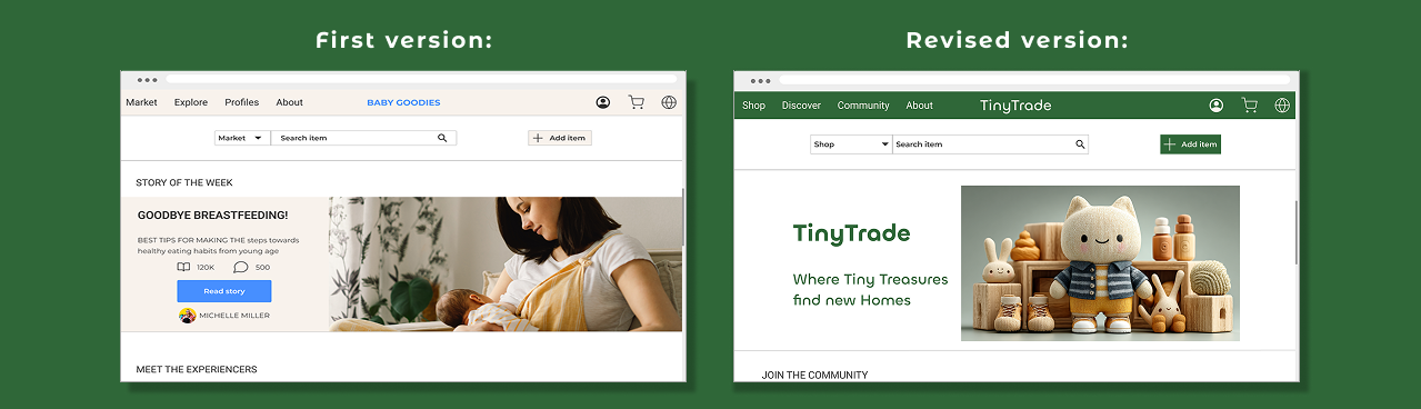
‘Home’ Wireframes
Here’s a polished version of your text:
‘Home’ Wireframes
This page underwent multiple evaluation stages. Initially, users were confused by the division between ‘Market’ and ‘Explore,’ and the main purpose of the platform was unclear. To address this, I introduced a brief description at the top of the page to clearly communicate the platform’s goal. From the lest is the evolution of the homepage design.
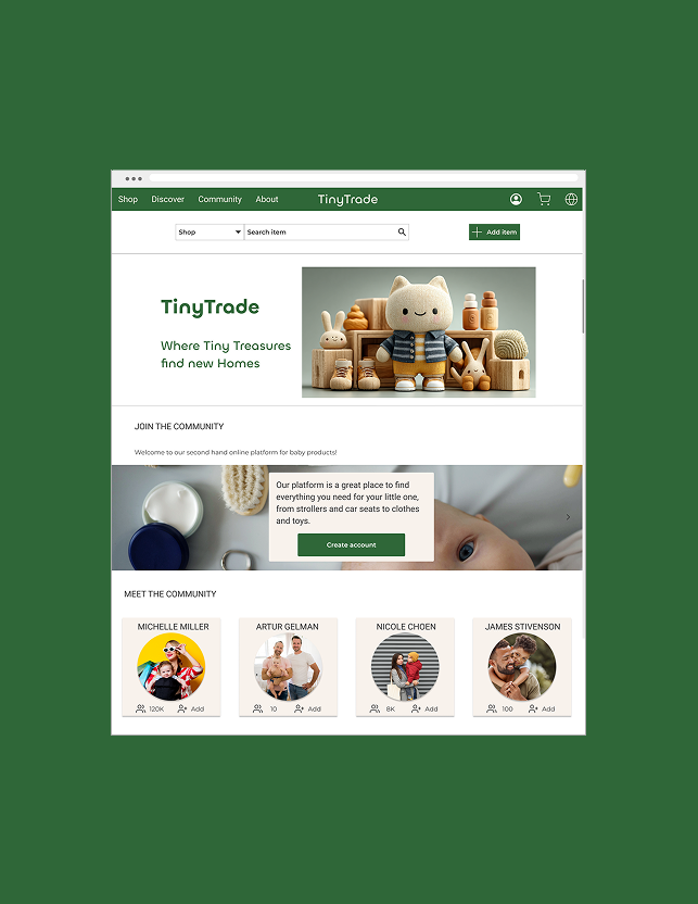
‘Add Item’ Wireframes
Here is the evolution of the ‘Add Item’ wireframes. Initially, I placed the category filters and image upload at the beginning, with the title and description at the end. Later, I realized it would be more intuitive for users to start by entering the title and description, followed by categorizing the item and adding pictures.
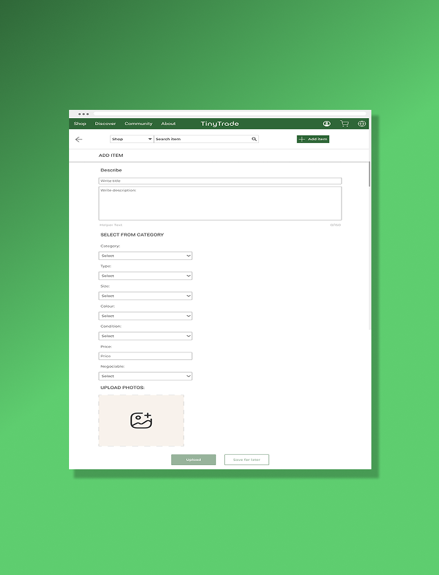
‘Purchase’ Wireframes
This frame displays the purchasing process, where the user can enter their address and shipping details, review the selected item, and see the total amount before completing the order.
Prototype
After conducting the usability test, I revisited the last details to make the app flow work smoothly. Here you can see a short video of the final prototype.
Click on the video below to see the prototype in action.
Conclusion & Key Takeaways
Leading TinyTrade from zero to a high-fidelity prototype reinforced my ability to manage the end-to-end product design lifecycle autonomously, without a Product Manager.
Key Learnings
Data over Assumptions: I initially skipped the Card Sorting phase, which led to navigation friction and confusion around button labels during testing. This was an invaluable lesson: validating Information Architecture (IA) early is critical before diving into high-fidelity UI. I quickly pivoted, restructured the taxonomy, and solved the friction.
Designing for Emotion: The biggest success of this project was learning how to translate a psychological barrier—lack of trust in strangers—into concrete UI features (verified tags, consistent layouts, community integration).
Retrospective
If I were to push this project further, I would focus on designing a robust onboarding flow to immediately build community engagement and prototype a secure, escrow-style in-app payment system.